
Comme Tu Veux
Branding
overview
Comme Tu Veux is a wine distributor that wanted a new visual identity which would stands out in their industry. Most competitors communicate luxury and stuffy ‘hoity-toity’ grandness. Comme Tu Veux wanted to communicate adventure, fun, togetherness, vibrance and creativity in a welcoming manner to their culture-loving, dinner-party hosting, younger target audience. All while following accessible design recommendations.
As the company owner plays with light and layers in his own creative practice, I wanted to connect those dots in this endeavour too. Inspired by stained glass, filled wine glasses, and the work of Alexander Calder (one of the owner’s favourite artist), I formed a simplified image of various wine glasses being clinked together.
extra detail
For this client I designed a brand new visual identity, including logo, colour palette, and typography. All presented in a brand guideline.
Colour palette and typography have been tested to follow the Web Content Accessibility Guidelines (WCAG).
The Comme Tu Veux website is designed by Lieke Teluij using the brand guidelines.
Colours
Selecting the primary brand colours happens fairly early. The client didn’t want to use red, as it was too obvious for a wine company. At the start I guide clients through a few exercises to help them define their brand values. The chosen terms were: adventure, fun, togetherness, vibrance, creativity and welcoming. All design decisions will consistently relate back to those chosen values to ensure the visual identity truly represents them. Together we decided that the colours should also ‘taste yummy’. This steered the project into natural and vibrant colours.
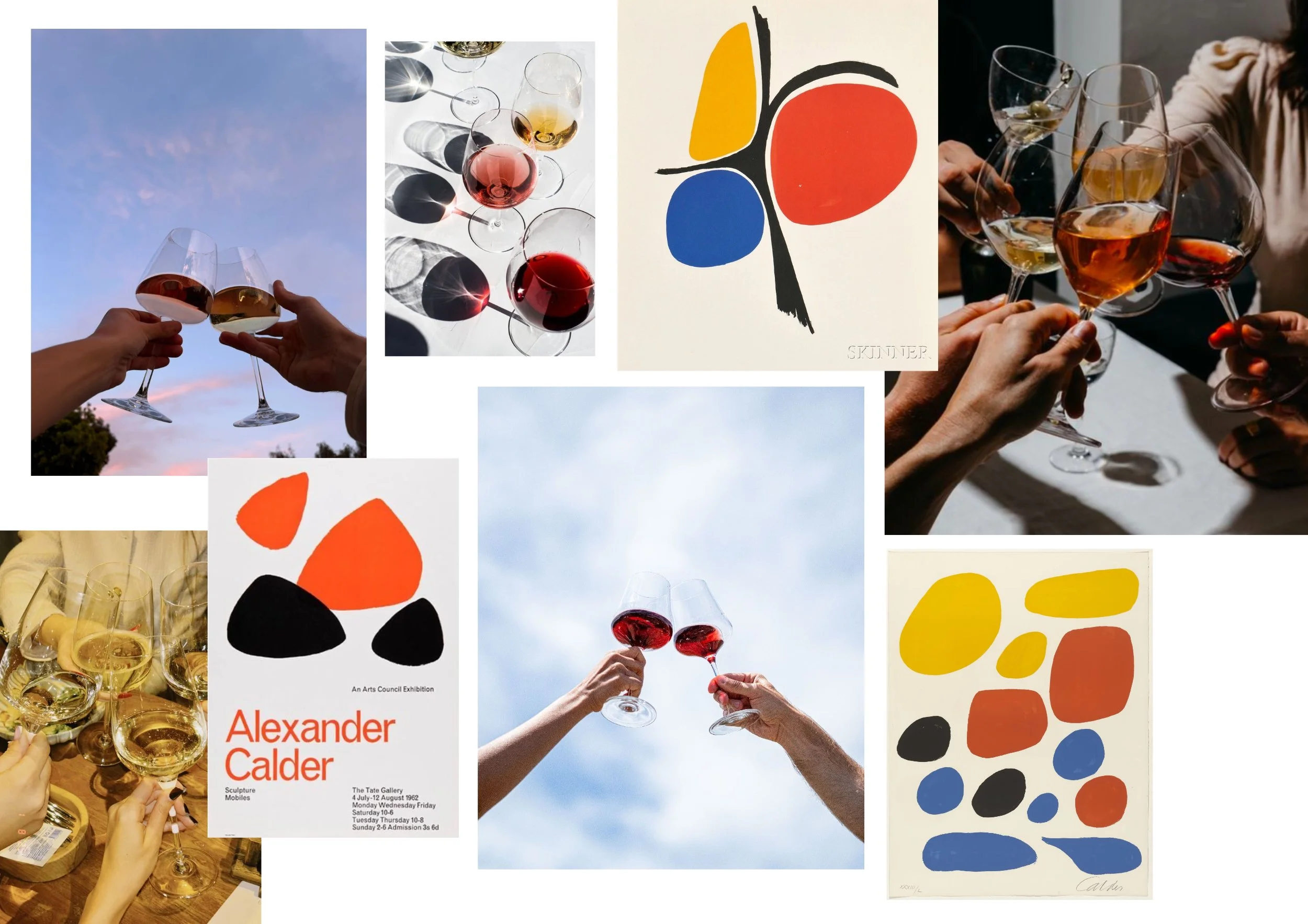
Inspiration moodboard
Logo
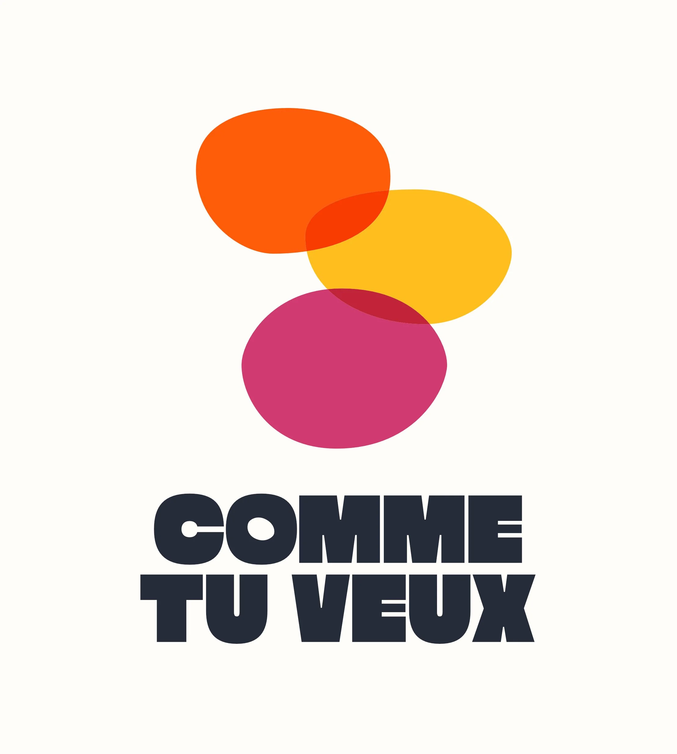
Using the shapes formed by wine inside a wine glass, and the imperfect, wobbly, human attributes of Calder’s shapes, the general logo composition took shape quickly. I wanted the shapes to overlap to create a dynamic and fun image.
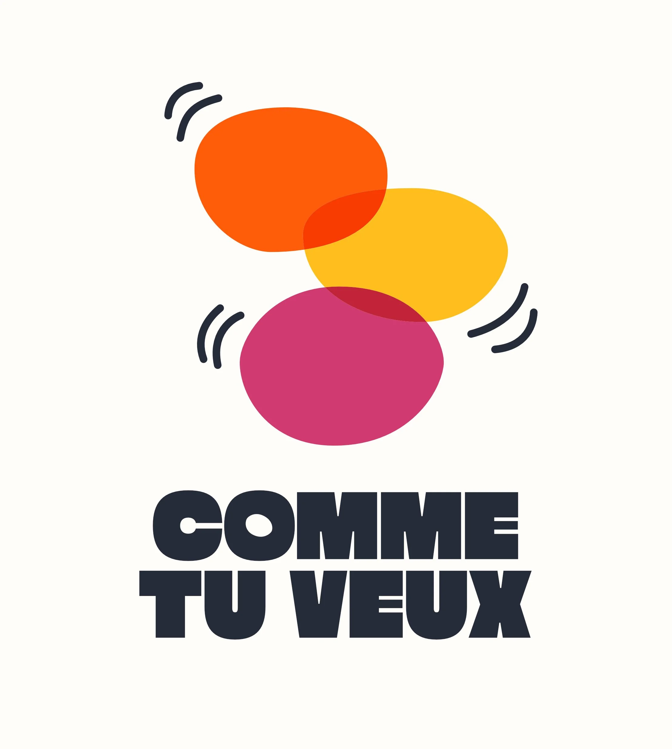
We played with the idea of adding more detail to indicate depth or motion. I added ripples in the wine and tested them with various brush styles. We also tried adding ‘clinking’ motion lines, inspired by Keith Haring. After processing all versions, we decided to keep to the original, minimal version of the logo, without any extra detail. This also makes the logo easier to use in a smaller scale, like in an email signature.
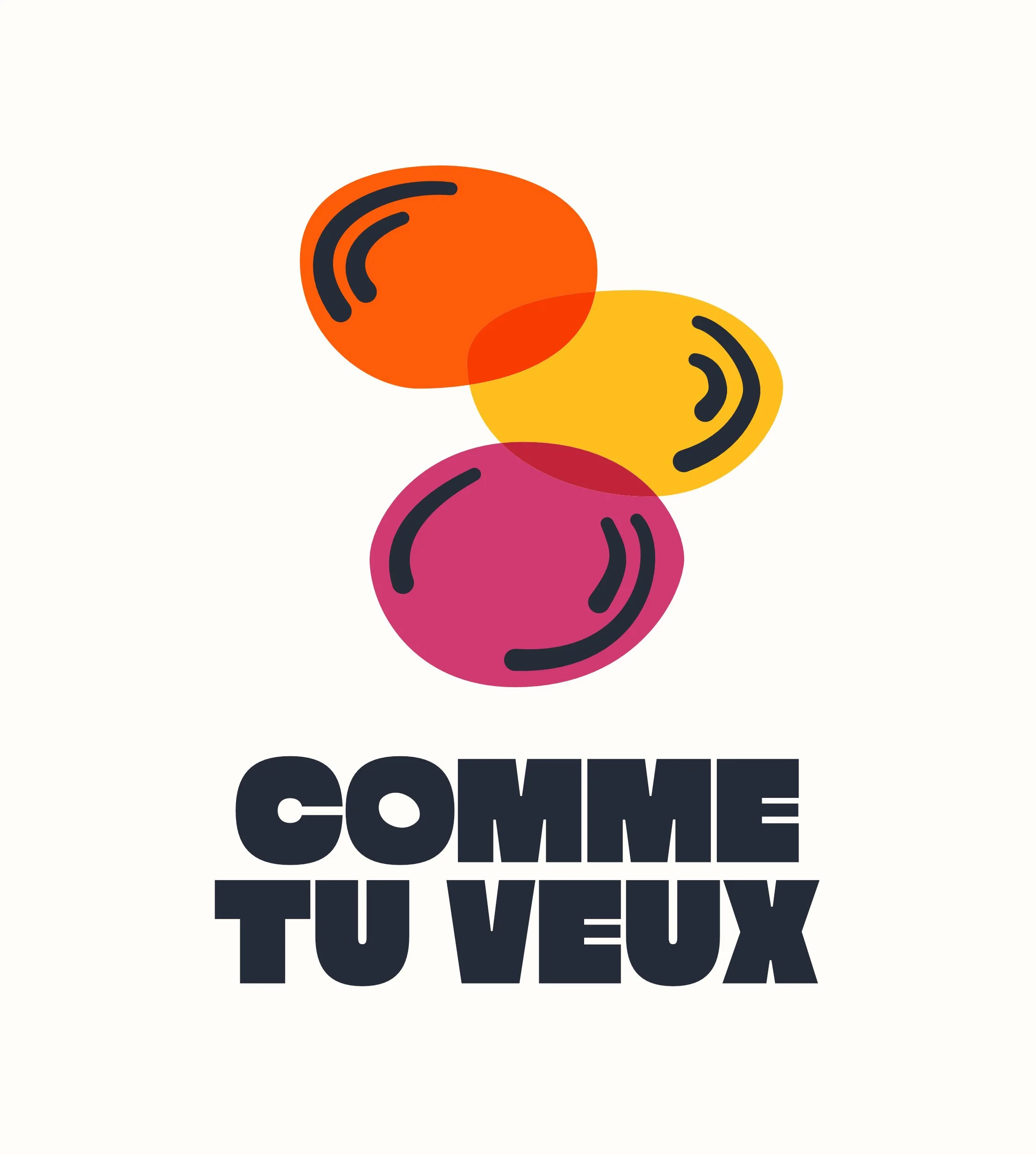
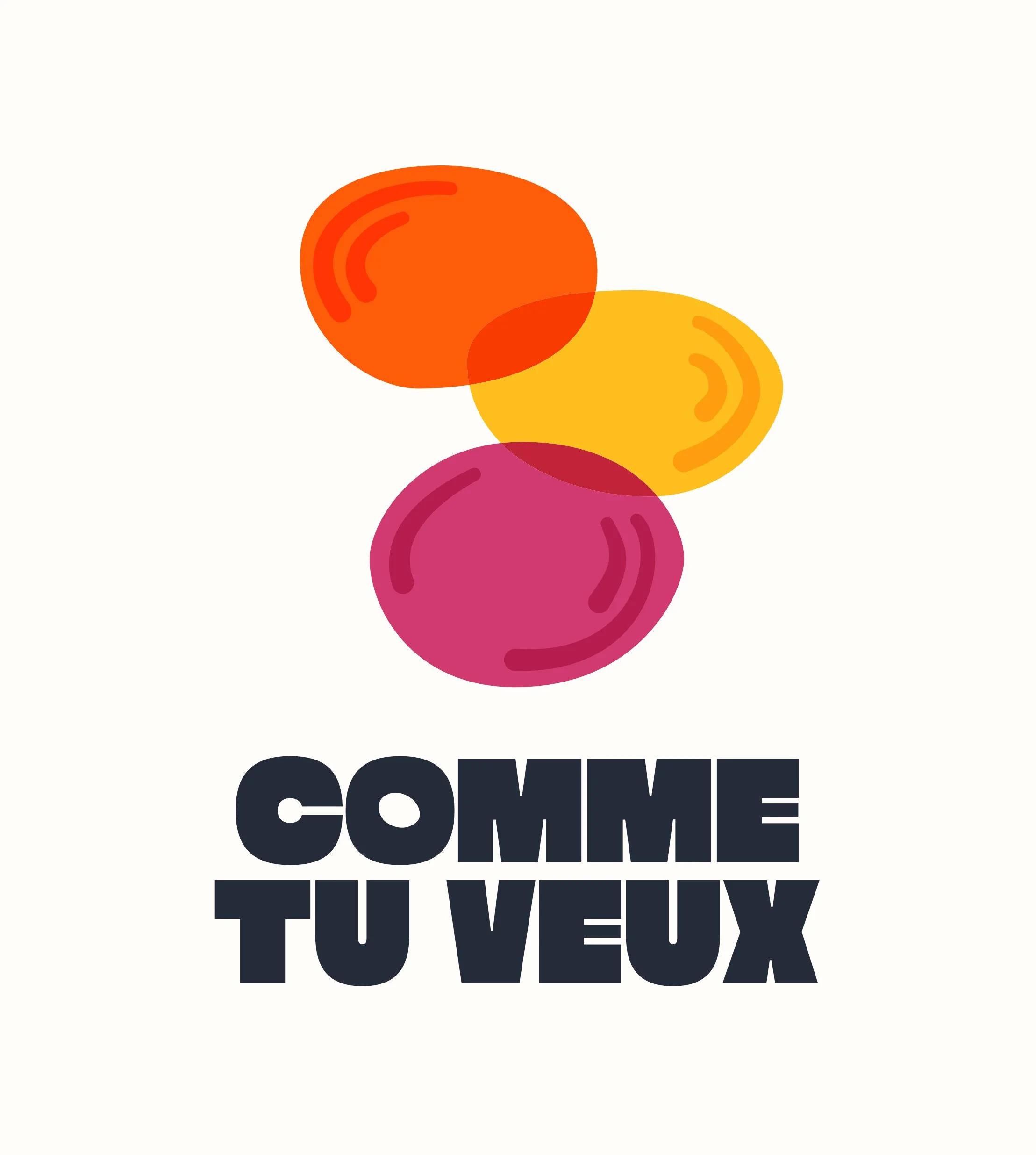
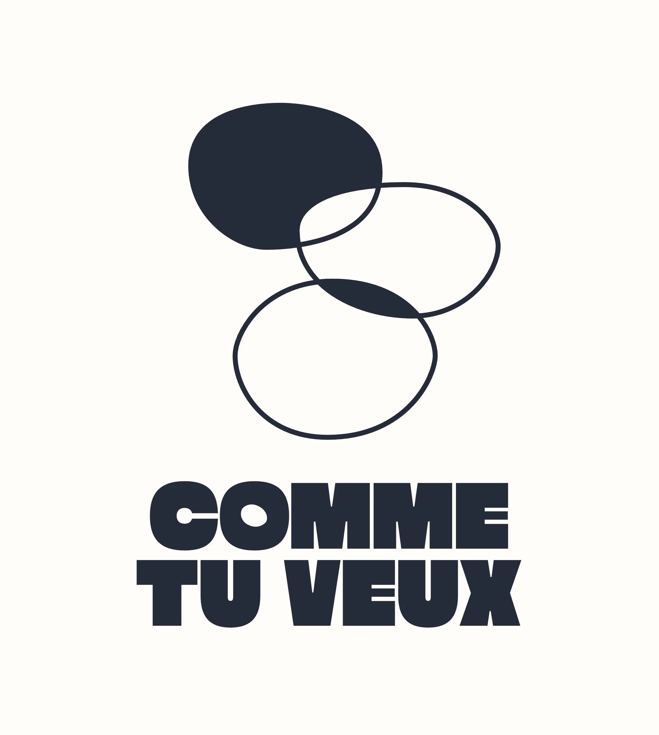
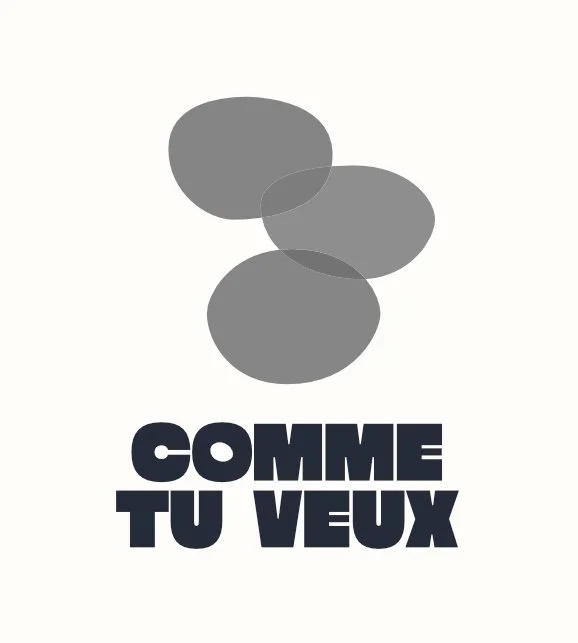
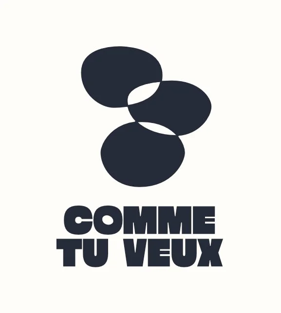
Another thought was: how do we communicate this logo in a black-and-white version? We could have turned the colours into grey-scale, but that makes the logo look dull. I tested how we could colour in certain parts of the circles instead. Mostly black was too heavy. Black on top also made it heavy. Black at the bottom makes it feel grounded and balanced.
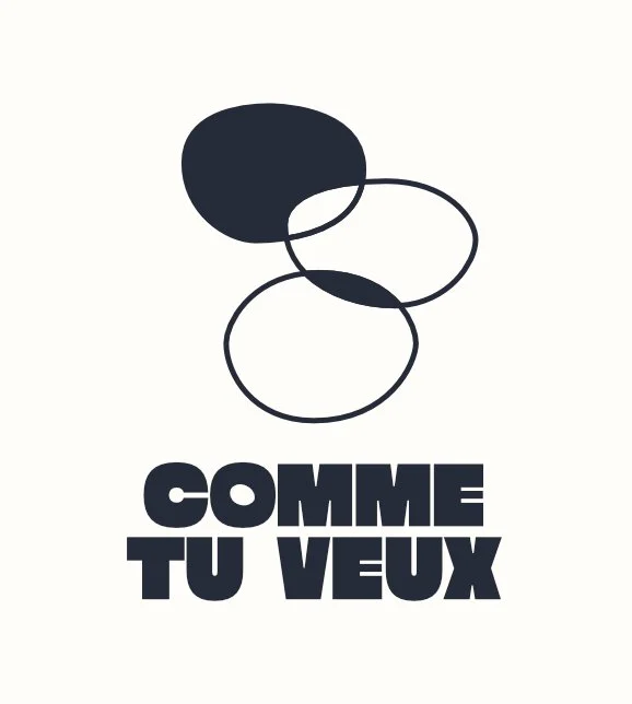
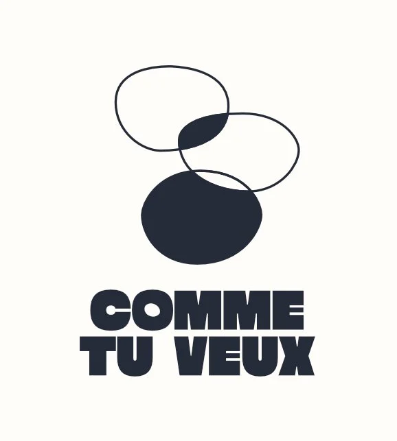
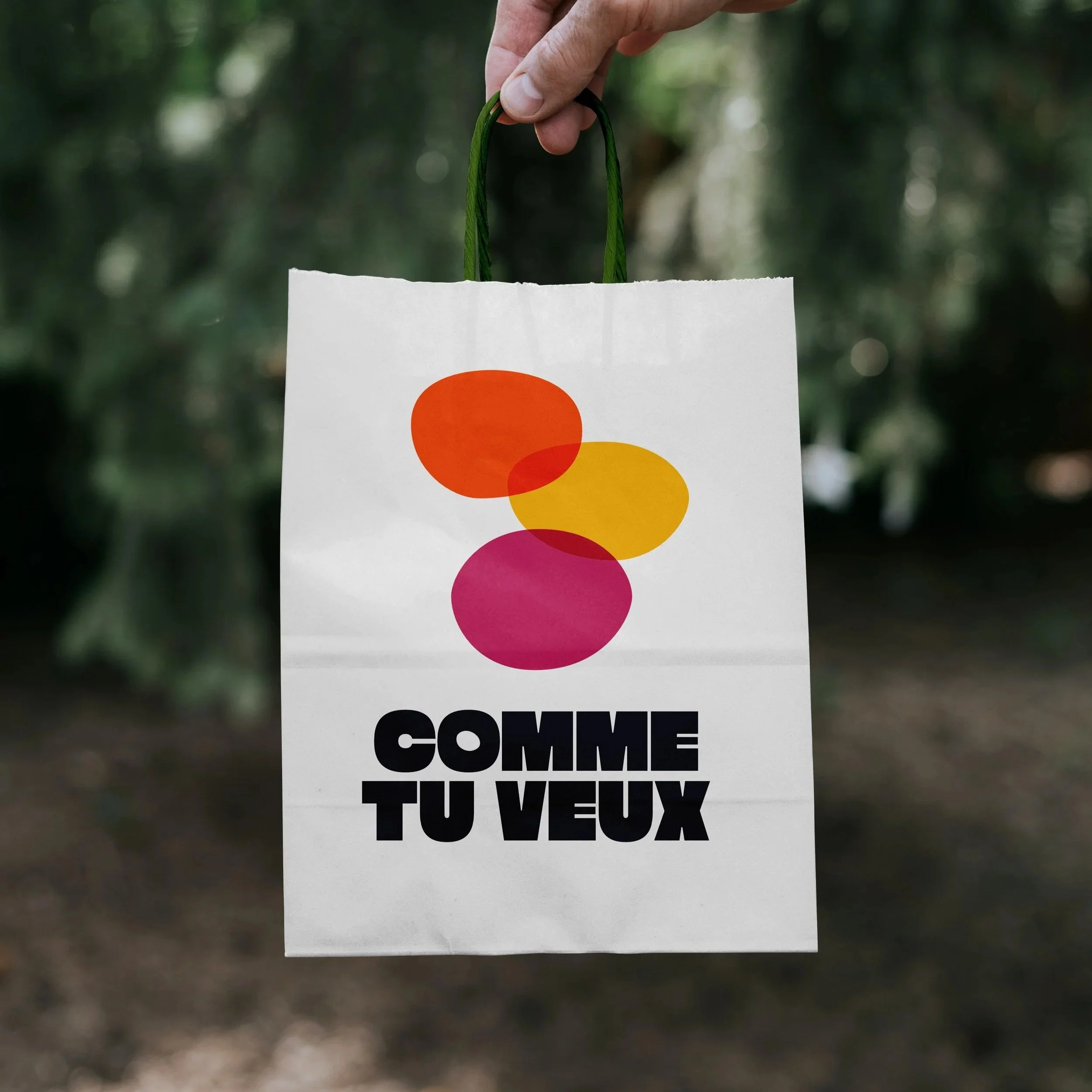
The final logo connects with the initial brand values and is available in colour and black-and-white.